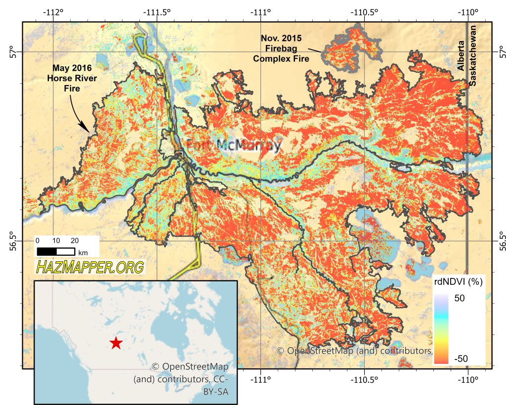
Fort McMurray, Alberta. The numbers are staggering: 1,500,000 acres, 88,000 evacuees, 2,400 homes lost, $9.5 billion CAD in direct and indirect losses. The fire was detected May 1, 2016 in forest lands some 7 km southwest of Fort McMurray. Canadian officials understood severe fire conditions were present and had helicopter crews surveying the area when they located the fire. The key factors in the growth of the fire were rapidly dropping humidity, increasing temperature, and above average wind speeds.

Using multi-spectral imagery to map the perimeter of forest fires is not a novel idea. NASA has a great fact-sheet on the Landsat Program’s contribution to mapping wildfire. Usually, fire perimeters are estimated by identifying vegetation loss. Digging in to the Landsat-8 archive with Google Earth Engine, we can see that HazMapper’s rdNDVI metric does a good job at approximating the published wildfire perimeter:
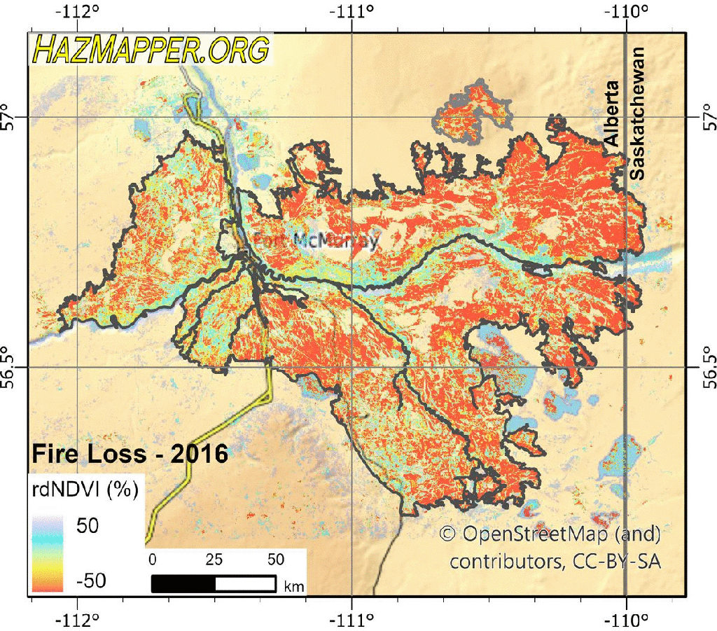
And just as exciting as mapping the loss of vegetation, is with slight modifications to event parameters in HazMapper, we can watch that vegetation come back through time. The following image and animated GIF compare the pre-fire conditions to conditions immediately following the fire (loss) and then to subsequent growing seasons (recovery). These recovery images are monitoring how with each growing season, we see a “re-greening” of the landscape. The new growth is comprised of different species compared to what was burned, but by 2019, many areas have returned to similar levels of healthy green vegetation, as indicated by near-0 rdNDVI values.
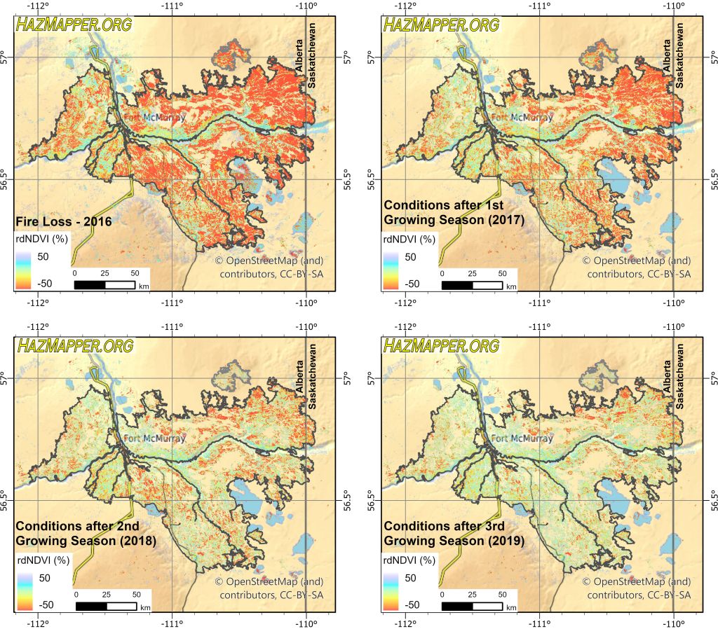
If we take the data from the above 4-panel figure and put it into an animated GIF, it makes it a bit more intuitive to watch the recovery:
These techniques work great in the Boreal forest or other heavily vegetated regions across the globe. The methods work less well in the arid western US, for example, where there is less vegetation to lose and the rebound takes much longer. We’re working on that, but if you have any ideas and are interested in collaborating, please send me and email and we can talk about building them into the HazMapper platform.
We were already working on this post when the May 2020 Florida and Mississippi, USA wildfires ignited, which is an exciting example of how multi-spectral imagery can help in rapid response efforts. We’ll continue to watch those fires, so stay tuned on the HazMapper Twitter feed.
